You’re building a website and don’t know where to start, OR you’re in the middle and you’re sure something is missing. We’re here to help you figure out what your website needs.
Here are a few things to think about before the web design process, things to fold in during designing, and things to help put the finishing touches on your site.
- Simple Yet Effective

Having an aesthetically pleasing design is a good way to keep your visitors around for longer, and encourage them to explore. A simple layout minimizes confusion when a user is navigating. Decide on a Color Palette, but limit it no more than 5 colors. Figure out which fonts you want to use, but don’t go overboard with too many of those either. It’s all about building a cohesive site where everything feels like it fits.
2. Website Loads Quickly

In the age of information, we are used to having all the information we need at the press of a few buttons on a smartphone. Having to wait for our content is not something we take kindly to. Making sure your website loads in a few seconds is imperative for keeping your visitors around!
3. Website Security
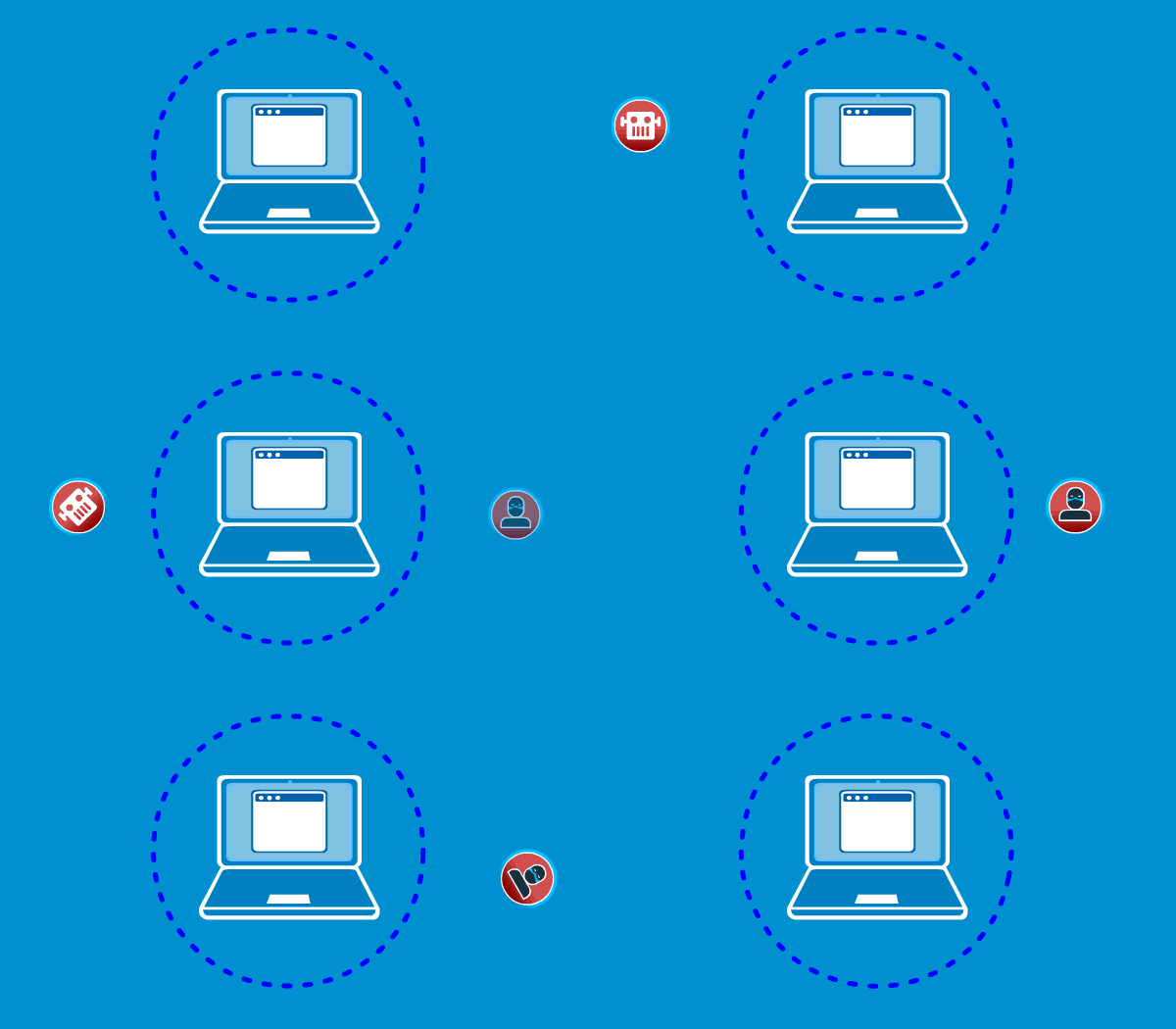
Making sure your website is secure is absolutely necessary if your site offers transactions. Users shouldn’t trust your site with their payment information if it isn’t secure. Even if your site doesn’t offer online transactions, having a secure site will earn trust with more users. Starting in July 2018, Google will be marking sites listed on their search page as “Safe” or “Not Safe” based on whether the site has an SSL Certificate. How do you find out whether your site has an SSL Certificate? If your URL starts with http:// instead of https://, you do not have an SSL Certificate.
4. Get On a Content Schedule

Keeping a consistent schedule is important for keeping your website fresh. New content helps bring people back to your site to look for more. Common examples of content are a blog, or a portfolio of your work. Keeping these sections updated will help your site stay relevant and interesting.
5. Contact

Make it easy for people to get in touch with you! This can be done with a Contact Form. Often for online forms, a rule of thumb is keep it simple. If you want people to finish filling out the form, you probably shouldn’t have a 20 blank fields for them to fill out. What fields you should include vary by industry, but at the very least aim for the most important information, such as Name, Email, and Phone Number.
6. Integrate Social Media

Integrating Social Media into your website can be done in various ways, with different purposes. You can simply provide links to your different accounts, or you could display a feed of posts from Social Media. Regardless of which method you decide to use, integrating Social Media allows your website visitors to connect with these accounts, and increase your potential Followers/Page Likes to expand your audience.
7. Set Up SEO
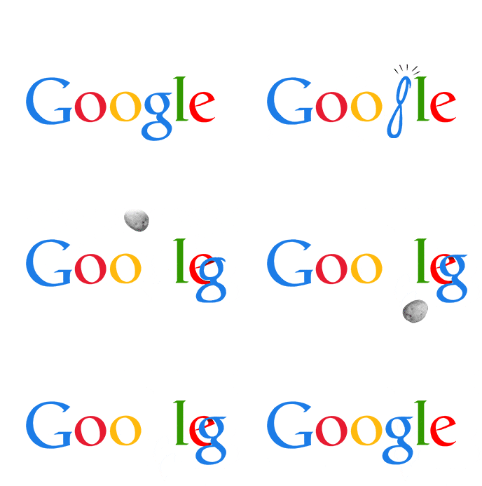
SEO (Search Engine Optimization) can be simply described as the process of making your website easy to find on Search Engines such as Google or Bing after a user searches. It goes without saying that a website on the first page of Google gets significantly more visitors than a site that is hidden on the second or twelfth page. SEO is designed to help you climb that list!
8. Call-To-Actions (CTA)
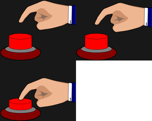
A Call-To-Action is a fancy word for a button on your site that asks the user to perform an action, let it be filling out a contact form, entering their email for a mailing list, or gaining access to a free download. Having an end goal for visitors on your site increases the value of your site for your business, as it can net new prospects or allows you to keep in touch with those who were interested enough to interact with your CTA. The CTA button itself should “pop” on the screen, which might take some experimentation. Pay extra attention to the color of the button, and the words on the button. Using the boldest colors from your site’s color palette may not work every time, but it’s a great place to start. Choose action-packed words for the button’s text, such as “Try Our Free Trial” or “Keep Me Updated” will grab the attention of users more than “Free Trial” or “Join Our Mailing List”.

