Google has made a lot of positive changes since August and they’re all aimed at creating a better user experience. In other words, it helps you and your customers get better, more relevant results when you Google things like “restaurants nearby” when you’re hungry or “local plumbers” when your basement is filling with water from a burst pipe.
However, these changes also mean that businesses like yours will have to up your online game. The biggest change we’ve seen is how Google’s ranking system works when someone searches for your business or your services.
To put it in a nutshell, Google knows that most searches are from mobile devices. So, they want to prioritize websites and landing pages that are mobile-friendly in order to provide the best experience for the end user. Basically – sites that aren’t mobile friendly will no longer appear in search results.
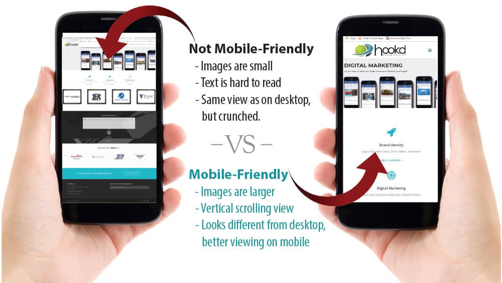
How do you tell if your site is mobile-friendly – just check! Look up your website on your mobile phone. If it looks just like your website when you view it on your home or work computer, but smaller, it’s not mobile friendly.. However, if your site appears in vertical format and you can scroll down it like a news article, congrats, it’s mobile-friendly! Here’s a quick side-by-side to help show you the difference.

The next question is: how to make your site mobile if it’s not? We recommend that you contact your website developer and ask about your options. In general, there will be a few different ways for you to tackle this:
Develop a separate mobile site. Here’s how it works… when someone is looking up your site from a mobile device, they’ll be shown the mobile site. However, when they look up the exact same site on a desktop computer, they’ll be shown the desktop version. It’s a smart solution. The downside – you’ll have two websites to pay for. The upside – it’s a great option for folks that really need a custom mobile experience.
Upgrade to a site that has responsive design. Here’s how it works… your web developer will just build one, new website. The website is programmed to automatically adjust to the screen size it’s being viewed on, so it’s mobile-friendly, tablet-friendly, and PC-friendly all at the same time.
If you have questions or would like to chat further about Google’s new search updates, feel free to reach out to me at Lee@hookdpromotions.com and I’ll be glad to chat with you!

